
What is colour theory?
If you’ve dabbled in any artistic medium, the chances are, at some point, someone has referred to ‘colour theory’. Colour is one of those things that scares a lot of people. So perhaps hearing that there is a whole theory on colour, is just terrifying!

In actual fact, although colour theory can be studied for years and can be very complex, the basics are very simple and very easy to use. So I hope to demonstrate here that colour doesn’t have to be scary.
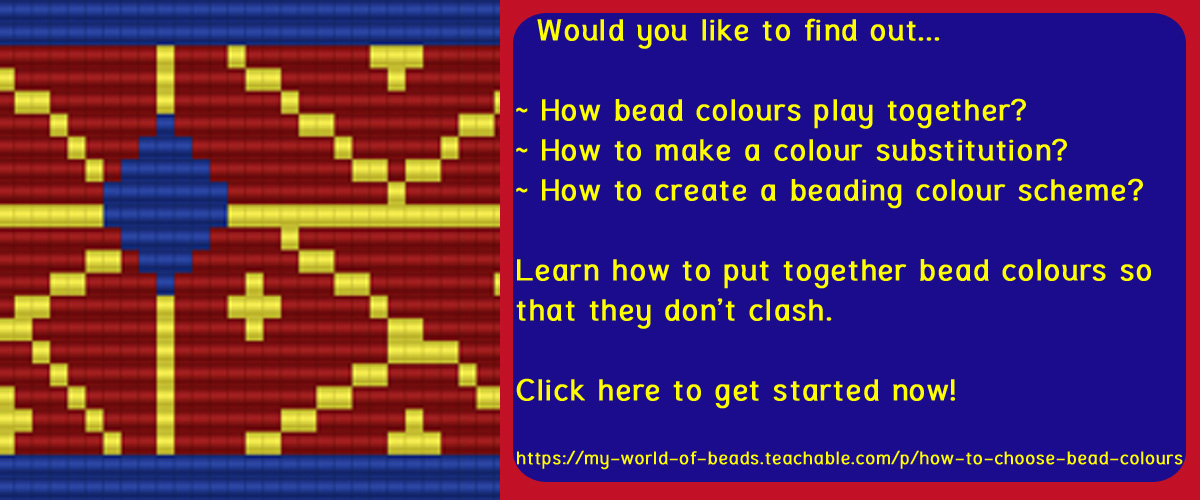
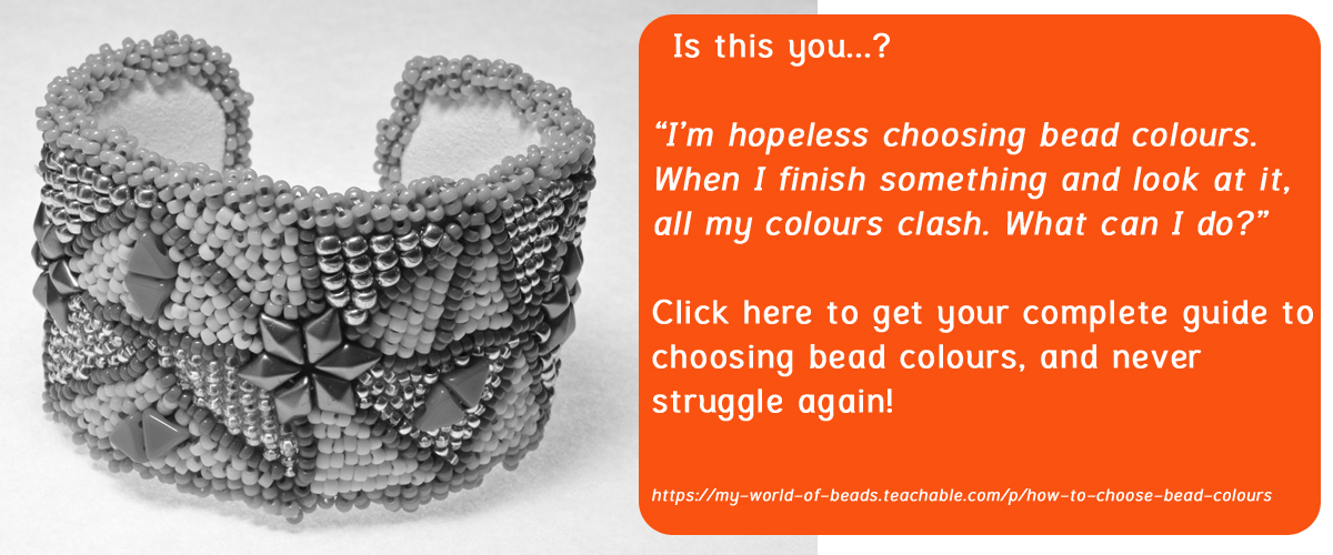
You know how some people just seem to pick colours and put them together effortlessly? Well, maybe they just have a naturally good eye for colour and the confidence to just go with whatever they feel like. Or maybe they know all about colour wheels and colour theory and use that knowledge. Well, if you’d like to learn, how about trying out my online class? You can find it at this link.
The colour wheel
So first, let me introduce you to the colour wheel. This is a concept that has been evolving since 1666 when Sir Isaac Newton first tried to place colours in a logical order for scientific purposes.
The basic colour wheel just orders the primary colours: red, yellow and blue. Typically there are certain properties associated with these colours. We think of red as being a warm colour. Blue is often associated with cold and yellow is bright.
If you want to get scientific, the properties of these colours are also affected by the way in which they absorb or reflect light. This is referred to as the ‘value’ of the colour. Yellow reflects the most light, so appears to be lightest in colour. Blue absorbs most light, so appears darker. We’ll come back to talk about value again later on.


Of course there are a lot more colours than just the three primary. But these other colours, are created by mixing the primary colours. First, we have the secondary colours. These are orange, green and purple. They are created by mixing two neighbouring colours on the colour wheel.
Orange is a mix of yellow and red, so sits between those two colours on the colour wheel. Green is a mixture of blue and yellow, so can be found between those colours on the wheel. Purple is a mix of red and blue, so guess where that sits on the colour wheel?
This is still not a full range of colours: if you mix further, you get the tertiary colours. There are six of these and each is a mix of one primary and one secondary colour.
They have the rather convoluted names of:
- yellow-orange
- red-orange
- red-purple
- blue-purple
- blue-green
- yellow-green.
Not perhaps the easiest terms to remember! Hence we may be more used to names like turquoise, mauve, topaz. But each of these will approximately correspond to a shade of colour.
Why do you need a colour wheel?
This is all very interesting (or perhaps just plain confusing!), but what is the point of creating a colour wheel?
The human brain is designed to see colour combinations in a way that it finds appealing or repulsive, depending on the combination. When you are creating jewellery, you want to be using colour combinations that are appealing, or ‘harmonious’. So, the colour wheel is a tool that can give a few rules as a guide to what the brain will find appealing.
In an attempt to put this simply, the brain is going to find a colour scheme harmonious if it doesn’t have to spend too much time making sense of that scheme. Over the centuries of colour theory, people have devised mathematical rules for picking colours that the human brain is going to find easy to process and therefore ‘harmonious’. The two most basic rules are ‘complementary’ and ‘analogous’.
Complementary colours
A ‘complementary’ colour scheme uses colours that sit opposite one another on the colour wheel. Think of a field of poppies: green grass, punctuated with red flowers. Or the traditional seaside: blue sea and yellow sand.
These are complementary schemes and we see them throughout nature. They are exciting to see because there is a strong contrast between the colours and they offer great scope for play in design as you can change the balance of the quantity of each colour.
You could make a necklace that had perfectly balanced quantities of the two colours. But it is more interesting if you use more of one colour and treat the other colour as a means of ‘highlighting’.
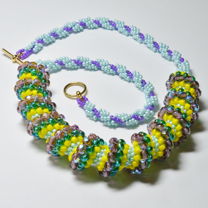
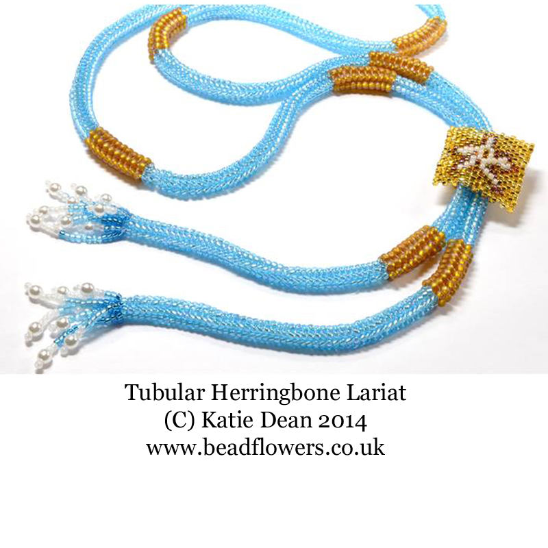 In this lariat, I used blue as the predominant colour and created yellow highlights. The effect is soothing because the blue is most prominent. Had I made it predominantly yellow, with blue highlights, the effect would have been much brighter.
Analogous Colours
An ‘analogous’ colour scheme uses colours that sit next to one another on the colour wheel, for example red and orange. Think autumn leaves: shades of red, orange, yellow and brown.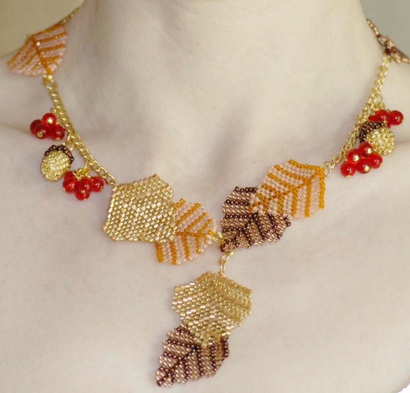
This creates a softer effect and you can play around with blending colours. I did just that when I created this ‘Autumn Leaves’ necklace. Once again, depending on the quantities of each colour that you use, you can create highlights. In this case, the eye is immediately drawn to the red berries as they stand out against the softer orange/gold/brown hues.
You might be tempted to think that colour schemes will only work if you stick to two or three colours. But in fact, it can be more difficult to get an appealing balance of colour when you are dealing with just a few colours. Paradoxically, the more colours you add into a scheme, the less you have to worry about balancing them correctly.
Going back to nature: think of a rainbow – it uses all the colours in the spectrum and is very pleasing to the eye.
Colour Theory Basics
So far I have been focusing on ‘hues’: this is the technical term for the colours themselves.
When we talk about colour theory, we also talk about shade: light pink and dark pink for example. The technical term for this is ‘value’. Colours with a higher value are lighter and colours with a lower value are darker.
Values are not static. They will change in relation to other colours. So, for example, a yellow may seem to have a high value (be lighter) until it is placed next to white. Suddenly the yellow becomes the darker shade and the white is the colour with the higher value.
Seeking harmony and interest
Going back to the point I made earlier about the brain seeking harmony in its colour schemes. Another element of this mysterious ‘harmony’ is about interest.
If everything melts into one, then the brain quickly ‘switches off’ and dismisses the scheme as forgettable and boring. Subconsciously we are all seeking something that makes us think, or takes us on a journey.
If you’ve made a stunning necklace, you want people to keep looking at it. First they notice the focal point at the front – perhaps a pendant. Then they travel round and admire the beading on which that pendant is suspended.
Choosing the right shades of colours can help you to do this.
Try a little experiment… Take a few tubes of beads in different shades of the same colour (for example, silver lined, opaque, Ceylon, transparent) and lay them next to one another. Stand back a little and see which tube your eye is drawn to first. Most likely it will be the tube with the lightest value.
Applying colour theory to beadwork
How do these ideas translate into beadwork?
Let’s take an example. If you make a necklace that uses all Ceylon finish beads in different hues (Ceylon pale pink, Ceylon pale blue, Ceylon mauve) you will find that the eye just sees the general shape of the necklace. So, you may have spent hours creating complicated patterns with those colours, or shaping the necklace beautifully. But there is nothing to help people appreciate that effort when the jewellery is being worn.
This can be a useful thing to know. So, if you just want people to appreciate a general shape, then deliberately keep your values similar. But you could achieve the same effect just using a single colour.
Click here to try this necklace pattern
If you have made a necklace with a fantastic beaded clasp that you want everyone to notice, plus a beautiful pendant, then make these two components in lighter value beads (like yellow, or a silver lined shade). Make the rest of the necklace in darker value beads. So it will just set off the areas that you want the eye to focus on.
The same applies if you have worked a pattern into your beadwork. Make sure you have used a full range of colour values, from light to dark. Then, make sure that the dark values are the background areas and you have highlighted the parts you want people to focus on by using lighter value colours.
Hopefully this has given you some ideas and some structure within which to experiment. But you are really only going to learn about colour by using as much of it as possible and playing. If you want to really learn how to work with bead colours, then check out this online class.